Treasury Cube
External Website Redesign + Internal Dashboard UX

My Role
UX & Brand Designer
Led research, information architecture, and visual redesign for the external website.
The Problem
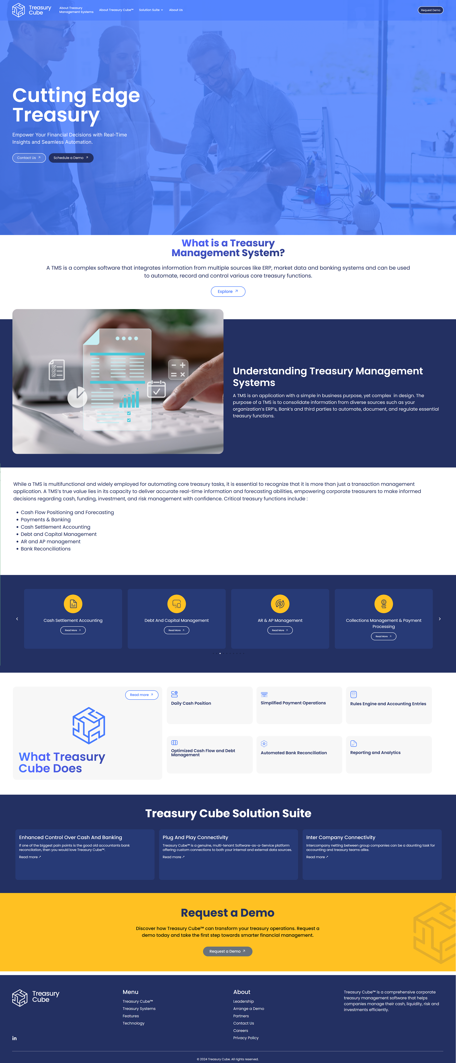
Treasury Cube’s external website had grown complex and difficult to navigate.
As the company expanded, content increased without a clear hierarchy, making it challenging for users to understand the product or determine what mattered.
The Challenge
The team needed a full website redesign in two weeks without losing critical information.
How I Enabled Fast Development
To keep momentum high and reduce development risk, I paired the design with clear execution artifacts.
Designed and iterated screens in Figma
Built interactive prototypes using Canva Code so stakeholders and developers could experience real interactions before build
Created a Trello board from scratch to track scope, feedback, and progress
Wrote user stories for each screen to clearly define behaviors, states, and interactions for development
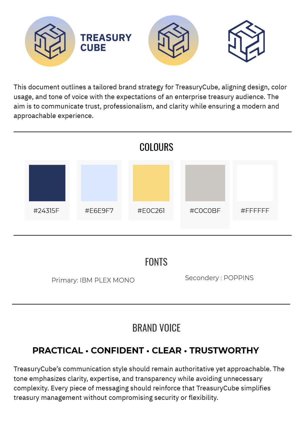
Refined and updated the logo in Adobe Illustrator to align with the new visual direction
This approach helped the team make decisions faster and allowed developers to build with confidence.
The Process
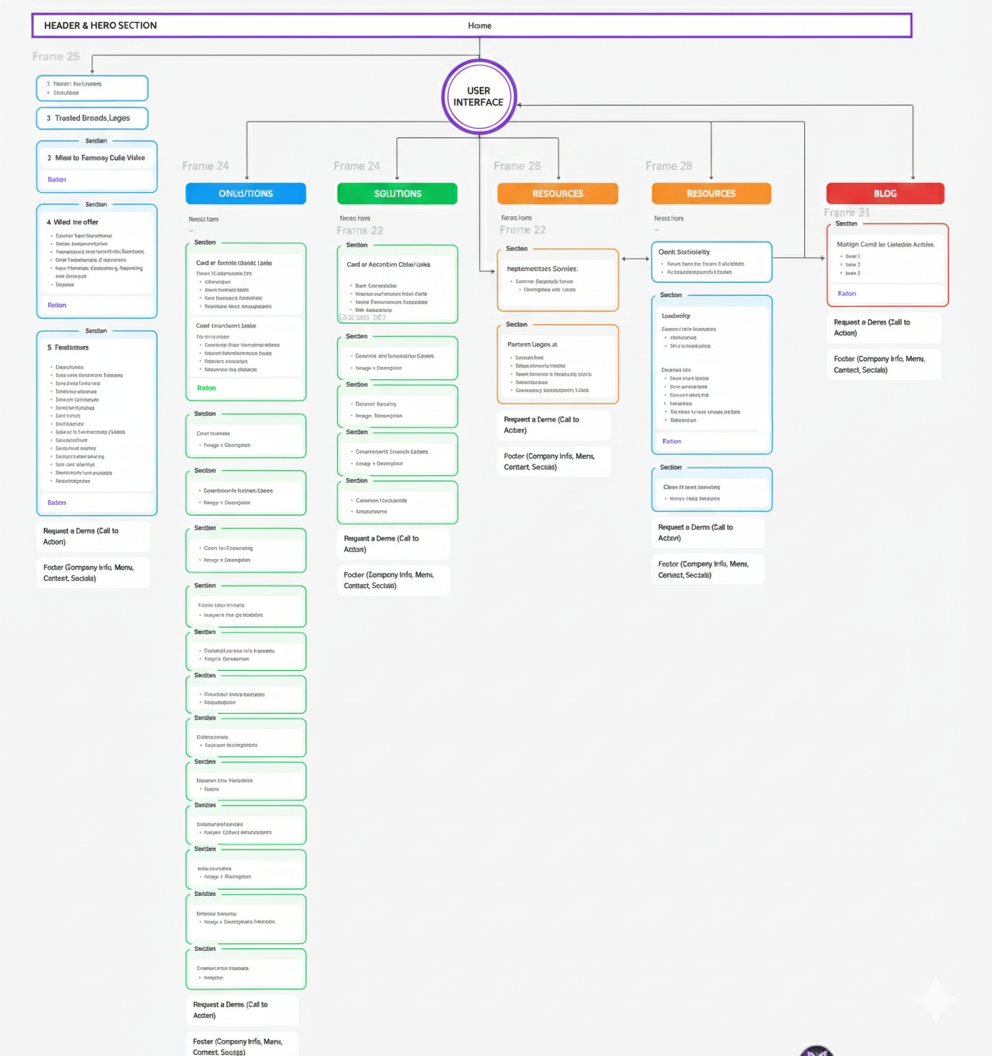
Clarified site architecture for a large, information-dense fintech product
Designed and iterated the website in Figma under a tight timeline
Collaborated with stakeholders and developers using rapid, interactive prototypes
Validated designs with 3 user tests to refine navigation, messaging clarity, and CTA flow under a tight timeline.
Brand system & logo guidelines
Defined scalable logo lockups, typography, and usage rules to ensure consistency across web, social, and future media.
The Outcome
Full external website redesign delivered in 2 weeks
Clearer navigation and content hierarchy
Scalable structure for future growth
We have improved clarity and findability based on rapid feedback from three users, all while meeting client requirements.
Internal Product UX proposal for Treasury Dashboard
Improving clarity and readability for a complex, data-heavy treasury platform.
The UX Problem
The internal treasury dashboard was information-dense and difficult to scan, with unclear visual hierarchy, inconsistent components, and limited affordances for quick decision-making.
Users struggled to:
Quickly understand cash position and status
Visually distinguish priority data
Navigate dense tables and charts efficiently.
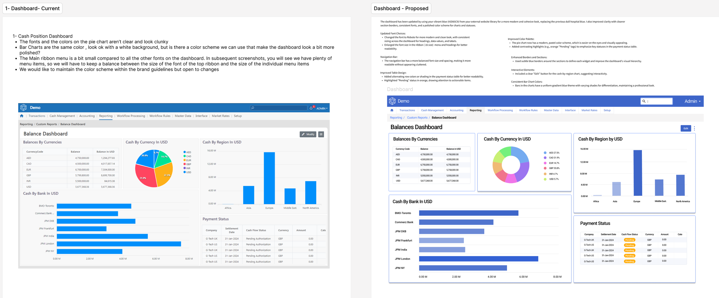
The Approach
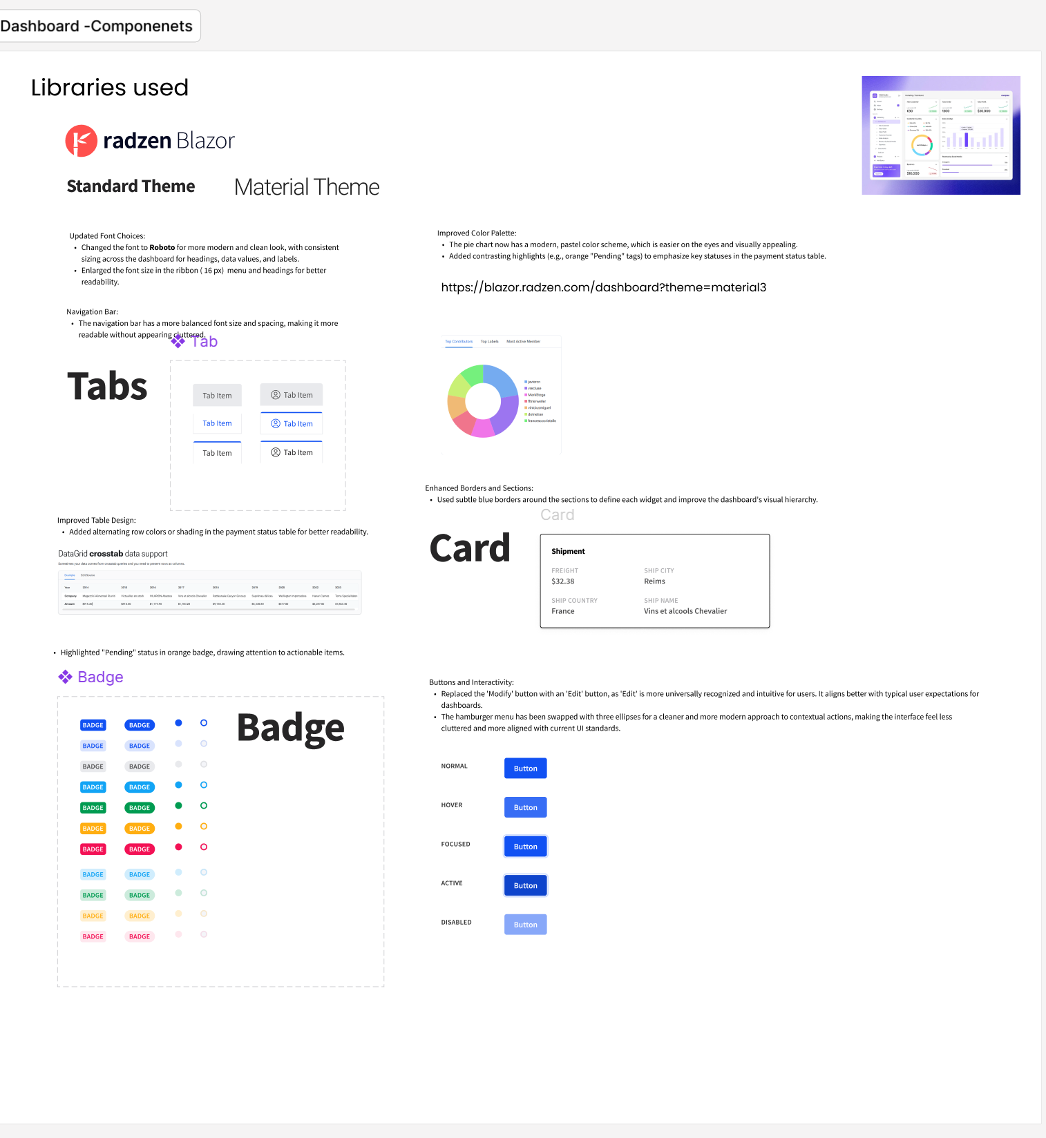
Audited the existing dashboard against UX and data-visualization best practices
Reworked layout hierarchy, spacing, and component consistency
Simplified charts, tables, and status indicators for faster scanning
Designed reusable UI patterns (cards, badges, tabs) aligned to the system
The Outcome
Clearer visual hierarchy for financial data
Improved scanability and readability across dashboard views
UX-ready screens delivered for engineering handoff and iteration